The homepage plays a crucial role in the customer’s buying journey. If you have created an effective home page, visitors are less likely to bounce. Once they click on a product, they are more likely to buy. Imagine walking up to a restaurant, you’re more likely to go in and check out the menu if the restaurant looks inviting. Perhaps it’s bustling or shows you appealing dishes on a handwritten board outside. The restaurant’s exterior and façade is like the homepage of any ecommerce business. The homepage doesn’t convert visitors to buyers on its own. Instead, the objective is to get visitors to click or view a product or category page to bring them ‘in’ to your store.
To optimize the homepage, you have to understand the psychology of your visitors and potential customers. The purchase intent of a visitor who lands on your product page is usually higher. So the goal of any homepage is to encourage the visitor to view a category or product page.
In general, there are two main challenges to solve with homepage design:
- Many different products means different customer segments. How can a homepage appeal to different customers given its limited real estate?
- The chance of closing the sale for visitors who have clicked/viewed at least one product is much higher. How could we create a homepage that encourages as many visitors to click on a product?
Let’s look at some successful Shopify stores and look at how they solve it.
To start, we’ll review the most important elements that a high-converting homepage has.
1. Clear unique value proposition
What makes you different? To attract first timers and build loyalty with repeat visitors, you need to make this clear. Why should someone buy from you? Are your products unique? more affordable? Or do you have the fastest delivery? a unique style?
Communicate this clearly on your homepage to make the most impact once visitors land on your site.
A great example is Allbirds, Once you go to their homepage, the first message that pops out is “Light on your feet, Easy on the planet”. So you are aware that they have high-quality shoes that are good for the environment. This immediately draws attention and invites visitors to click on a product.
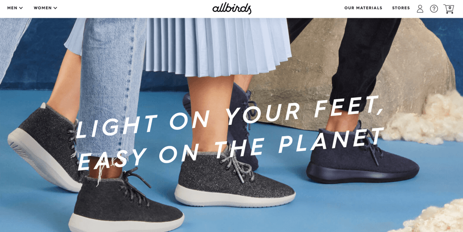
Figure 1 Allbirds has a very clear value proposition front and center on their homepage
2. Add category images for clear navigation
In any given e-commerce website, the more products you have, the more diverse your customers and what they look for. Humans process visuals much faster than text. When the visitors land on your homepage, they may not have a clear idea of what they want to buy. For this reason, relying on them to navigate your menu bar or search function to discover products they might like could lead to lost sales opportunities.
A better way is to showcase your popular categories on the homepage. Remember the goal of your homepage is to get every visitor to take an action, to view a category or product page. Therefore every element on your homepage should help you achieve this. Start by thinking about different customers that you have and if you can put them in different buckets. If you’re running a furniture store, it could be a different style they are after (Nordic, vintage, minimalist etc.) or occasions if you have a fashion store (party, wedding, job interview etc.).

Figure 2 Fashionnova shows bright and attractive images of their main categories on the homepage to get visitors to view the category page
If you’re already doing this, the next step is to show different images to each visitor based on their interest.
Using an app like DataCue, you can upload all your category banner images in one place. The app will then automatically show different images on your homepage to each visitor based on their browsing history.

Figure 3 Inspirations Dancewear shows each visitor different images based on their last category and product views and purchases.
3. Use personal history for personalized recommendations
Your e-commerce website sits on valuable insights about your visitors, namely what they are interested in and their preferences. Done right, you can mine this information and use it to show each visitor only products they would be interested in.
After all, 45% of visitors are more likely to buy from an ecommerce website that offers personalized recommendations. The benefit of personalization extends beyond improving conversion. It’s a great way to improve customer loyalty as they feel that you understand their needs and they’ll remember you when they’re ready to buy again.
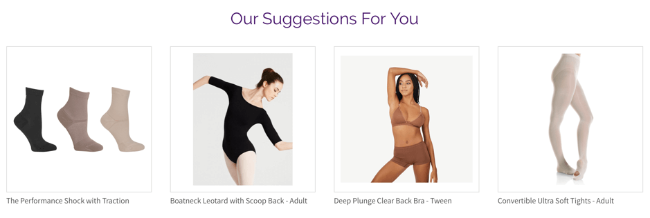
Figure 3 Personalized product recommendations improve conversion and average order value
If you’re not using any personalization solution at the moment, you can easily get started by featuring trending or the newest products. While this is not the best example of personalization, it shows your visitors what your best products are and gives them an idea of what to buy.
Most e-commerce websites offer some sort of product carousels on their homepage. However, we’ve found that the best practice for high converting product carousels includes the following:
- If you’re selling fashion items, the product visuals should be of someone using or wearing it. This kind of image helps your customers imagine how the product could look on them.
- Consider increasing whitespace between the products and completely eliminate borders to reduce noise and keep everything clean
- Add price, an add to cart button and reviews
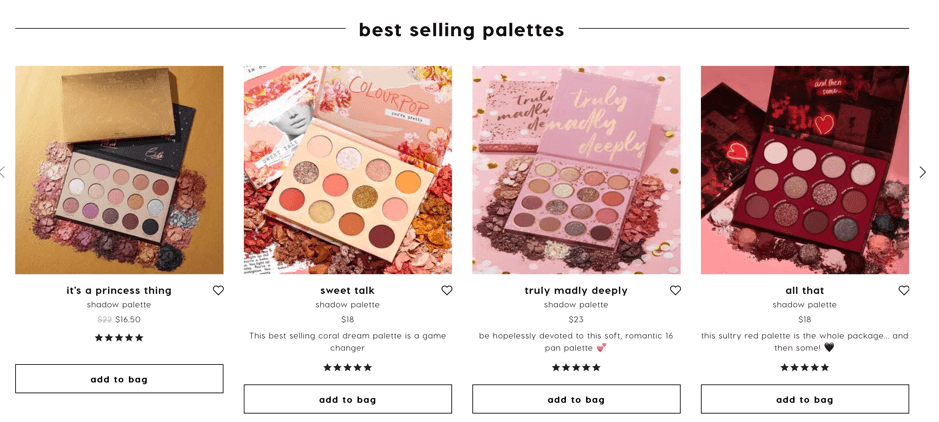
Figure 4 Colourpop’s product carousel includes price, add to cart buttons and customer ratings
A Shopify app like DataCue allows you to achieve exactly this. It’s a no-frill personalization tool that personalizes content on every page including the homepage for every visitor. The tool changes banners and product recommendations automatically based on who’s looking.
4. Personalization via localization
Personalization is not only based on specific browsing history. It can also be other general observations such as location, currency, season and time. If your customers are from different countries, you can adjust the currency and time to deliver automatically.
Doing this will reduce friction for your visitors to convert the price and shipping time on their own.
5. Drop the banner slider
Banners are great, sliders are not. While they might be useful at giving you more opportunities to show more offers and products, the benefits stop there. Carousels are distracting, slow to load and worst of all, they are not mobile friendly.
John Stutt from VaporFi ran an experiment by swapping the slider with static images. He found that the static images led to 12% revenue increase per session. Time on page also dropped significantly which is a good sign that visitors spent a short amount of time deciding which products or categories to view next.
A similar experiment found that after swapping carousels for static images, the click rate went up to 40.53% compared to 2%.
6. Design for mobile first
Transactions through mobile will reach 73% of all ecommerce sales in 2021. It makes sense to prioritize and keep mobile UX in mind when you make any changes to the homepage.
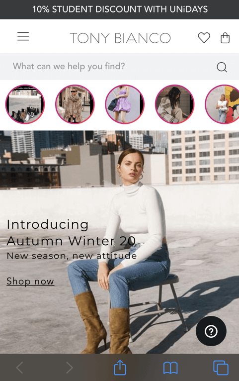
Take a look at this example on mobile. Notice a very prominent search bar that’s integrated with the latest Instagram posts as well as the top CTA for a 10% student discount.
And this is their desktop version.
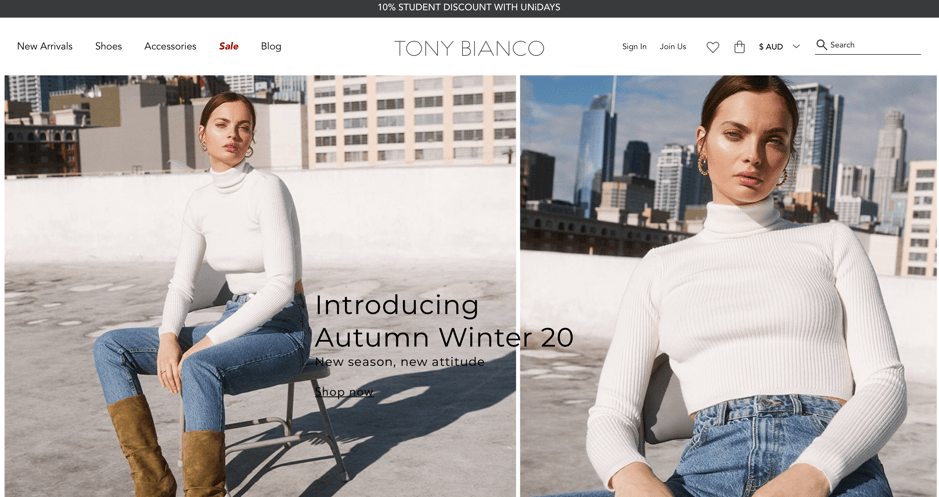
There’s no doubt Tony Bianco has designed their homepage experience with a ‘mobile first’ attitude. And it makes perfect sense when their customer base are young women who are constantly on the go and always checking their phones.
Other things to keep in mind when designing for mobile include:
- Big and friendly CTA
- Hamburger menu
- Make search bar prominent
- Design for a finger tap (i.e Design big, avoid pinch and zoom at all cost)
- Easy to navigate
7. Keep it simple
Online retailers have traditionally tried to communicate everything on their homepage and its products. Many A/B studies have shown that having competing messages is too hard to process. What do visitors do when they get confused? They leave.
This is related to Point 1 which is a clear value proposition. Decide what it is and make sure that your homepage screams the DNA of your brand. Make sure that it’s consistent and easy to follow. Your homepage needs to offer a clear flow for visitors to do next, whether using a search bar, clicking on the product recommendations or viewing the category pages.
8. Create urgency
Most visitors will not buy in the same session. They will browse around, compare prices and might come back to your website once they decide to buy. While they’re making the decision, you want to stay on top of their minds. The way you do this is through relevant communications through different channels such as:
- Desktop notifications to remind them of your brand
- Countdown SMS to create a fear of missing out
- Seasonal and promotional SMS to bring visitors back
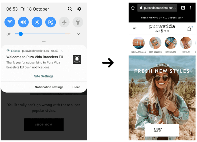
Pura Vida Bracelets customers subscribe to push notifications via a message on their website, they then receive a welcome message
And when they come back to your website, you can impress them with relevant notifications which show you that you understand their needs and what they look for.
A tool like Firepush allows brands and merchants to automate push notifications without the hassle. Customers automatically receive different push notifications at different stages of their purchase journeys.
Conclusion
The Homepage is the most prominent page of any ecommerce website. Yet, it receives less attention that it deserves. The goal of any ecommerce homepage is to get visitors to click on an image or product on the homepage and bring them ‘in’ to your store. Personalization and creating urgency are two great ways to optimize the webpage to ensure high conversion. A high converting homepage is easy to navigate, helps visitors discover products they like and brings visitors back again and again.
About the author Ann Pichestapong
Ann is the co-founder and CEO of DataCue. Her unique background as a data scientist and an ex-management consultant helps her use technology to solve real business problems for ecommerce. Her passion is to open up the power of personalization to everyone.
Post Credit:- https://getfirepush.com/blog/8-rules-to-optimize-for-homepage-conversions-from-top-shopify-websites/
