UX professionals can choose from a myriad of methods when it comes to the product design process and development. This article will give an overview of the product design steps and UX frameworks we consider to be essential. We’ll also provide a toolbox you can pick ideas from when designing a Minimum Viable Product, the first version of a product with just enough features to create value and provide feedback for future development.
The ideal product design process can vary depending on different factors, such as the UX project scope, the size of a company, budget, or deadlines — just to mention a few. In a good design process, the business requirements meet the user needs, which are satisfied within the feasible technical possibilities. Even UX studio’s product designers don’t have just one crystal clear guide for design processes.
Our UX designers often get together and share the experience and knowledge acquired from different UX projects we do for our clients. This helps us improve our design processes effectively, to meet the requirements and demands of the market. This is not only useful for a UX professional’s continuous development but also helps in designing a product that serves a client’s business needs the most.
During the product design process, we encourage an agile style of work, working in design sprints, but we are flexible if needed. If you need help with product design, reach out to us, and let’s discuss how we can help you.
Steps of a user-centered product design process
We utilize the Double Diamond product design process with four phases: Discover, Define, Develop, and Deliver. The product design process starts with the product discovery phase. We do not define anything yet; our UX designers and researchers look into the problem space, pinpoint the problems that should be solved, and determine a direction for the next product design process steps based on their insights.
The second part of the diamond — Develop and Deliver — is mainly based on the product discovery findings. However, this is not a linear process. The Discover and Develop tracks can run simultaneously and support and feed into one another at regular intervals.
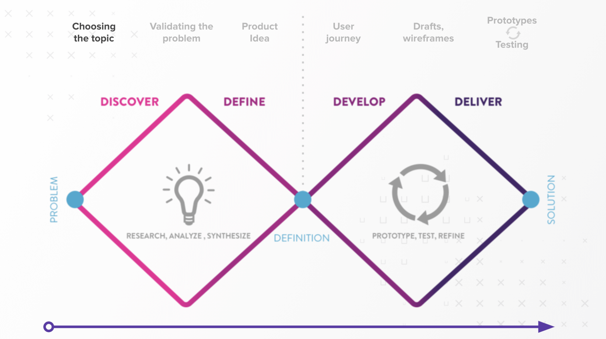
The Double Diamond product design process model
Based on the Double Diamond model, we follow four steps during the product design process in a flexible, non-linear way. In the next section, we will look into these steps in more detail:
- Step 1: Product discovery
- Step 2: Narrow down – Define
- Step 4: Brainstorming solutions, defining and prioritizing features
- Step 5: Narrow down – Deliver
Step 1: Product discovery
What problem we want to solve and for whom
Product discovery is the first phase of every human-centered product design process. Its purpose is to base the digital product idea on actual demand. While UX research is an essential part of this step, let’s not forget that carrying out research is not only important at the beginning of the product designing process but at any given product design phase.
Whenever there are too many open questions and uncertainties, different UX research methods can provide solutions and validate ideas, which, in the long run, will help to avoid burning money and waste time. UX professionals reach out to both the stakeholders and the users to explore the problem and opportunity space and find the fundamental pain points that need solutions.
In this section, we’ll look into two product discovery activities our UX professionals frequently use at UX studio:
- Kick-off workshop
- Exploratory research and user research
Market research findings are also important. At UX studio, we concentrate on UX research but if you’re curious about the differences between user and market research, check out our article on this topic.
Kick-off workshops
Meet your client, understand the current state of the project and the additional knowledge needed. Kick-off workshops are great for acquiring domain knowledge in a topic and get acquainted with the stakeholders.
To create the first draft of our roadmap, we start every product design process with a kick-off workshop that usually takes about one to two days. At this time, we get to know the company, its processes, and roles and gather all information we can about the project.
If our client already has some quantitative and qualitative data — about the market, client segmentation, competitors, target group, or buyer personas — we go through them, make a common understanding of the objectives and facts, and build assumptions and hypotheses.
The best way is to involve the widest variety of expertise we can and get as many insights from different company stakeholders as possible. It’s important to understand previous solutions and key business objectives such as KPIs or success criteria.
Kick-off workshop techniques we frequently use:
At this point, most of the workshop deliverables are assumptive, and that’s fine because we’re going to research what we need to validate or change.
- Assumption matrix
We collect the stakeholders’ insights on different topics, find the most important ones, and high-risk “leap of faith assumptions” so we can validate these with research and find out if they’re real. - Persona workshop
Assumptive personas are our best guesses on who will use the product and why. It helps us to recruit for interviews and for the client to empathize with their future users. - Customer journey workshop
These workshops help us get a view of how people navigate through the product or service. It is also an excellent opportunity for knowledge sharing with our clients. - Value Proposition workshop
We map out the perception of the value of the product identified by users. We also validate assumptions and thus Value Proposition for each customer segment. This provides vision and guides the design. - Brand Vision, Mission, and Values
The best way to reveal the vision is by asking the brand’s key personnel why it was created. For every answer they provide, we ask them to explain the why. After a few rounds of back-and-forths, we get to the heart of the matter. At the end of the kick-off workshops, we should have a clear overview of what we don’t know but should do so we can create a research plan to kickstart our discovery.
At the end of the kick-off workshops, we should have a clear overview of what we don’t know enough about but should do, so we can create a research plan to kickstart our discovery. If you’d like to learn more about how to organize a kick-off workshop, check out this article.
Research
There are various research methods out there. The simplest method that requires the least experience and professional knowledge is desk research. It is available for anyone with a computer with internet access, an account for social platforms, and some time to dig up the pain points of online communities and find opinions and reviews shared in social platforms, forums, mailing lists, or blog comments. Diary study can also be useful in some cases. If you want to gather data on a larger scale, you can use online surveys — preferably with a mixture of open-ended and closed questions — that can be used with qualitative insights from other methods.
Research methods we frequently use:
In the discovery phase of a product design process, we don’t aim to evaluate possible solutions yet as that comes later with usability tests. Still, we may already have assumptions to validate, and we certainly need to have a well-defined topic and a target group that is interested in our topic. At the same time, it’s crucial to keep an open mind to be able to discover entirely new aspects and problems of our audience.
- Semi-structured user interview
We use this method most frequently in the discovery phase of the product design process, as it’s relatively easy to organize and provides great insights. Starting with ten to fifteen interviews, usually provide enough understanding to move forward. We try to recruit interviewees from each segment or target group we defined earlier and involve the stakeholders in writing the interview script. Our researchers evaluate the previous results before each interview and iterate the questions to get the most useful answers from the remaining interviews. If necessary and our collaboration has the resources, we do follow-up interviews to dig deeper into sub-topics.
- Competitive research
It is very likely that by this point of the product design process, the product team already gathered the main direct and indirect competitors from stakeholder meetings and user interviews. More knowledge about successful competitors can aid us with feature ideas or design inspirations and can help us to position our client’s product. Even if there is no in-depth competitive research, we should at least maintain a competitor list in a collaborative spreadsheet or any cloud-based tool.
- Field research
Field research is an extremely reliable method as it is based on observing user behavior in their environment. But for this very reason, it’s harder to organize and conduct without influencing the users’ behavior and interfering with the natural way of executing their daily tasks.
Step 2: Narrow down – Define
This step of the product design process involves making sense of the data, synthesizing them, choosing one main goal to solve, and figuring out the “How” and the “What.”
By the end of the discovery phase, we are likely to have enough insight to synthesize our findings, refine our previous assumptive deliverables or create new ones by user analysis, define the core problem we want to solve, build themes, and deduce potential fields of action.
From the many possible synthesizing activities, we’ll look into three methods — the ones we use the most at UX studio — in more detail:
- User personas
- Jobs-to-be-done
- How might we
These exercises can be used at various points of the product design process; at the beginning, in an assumptive way, it can help with synthesizing the research data and define the project scope, but it can also be applied when ideating about solutions. The when and how depends on the team, project, and available insights.
User Personas
User presonas are fictional yet realistic representatives or archetypes of our key user groups with certain goals and characteristics. We use personas to help us understand and map out the main segments of our users, with their different goals and motivations. We can also use them to help us empathize with them in order to design a product that is the most suitable for the users.
At UX Studio, we create assumptive, theoretical persona mock-ups at kick-off meetings. If provided, we can use already existing research data, such as survey results, built buyer personas, or other related market research findings, to start off with, but at this point in the product design process, our personas should be validated and based on real user research data.
There are many contradictory opinions out there about whether it’s good to give names and faces to personas, if demographic data is relevant, if it needs to be printed, if it should include an empathy map, and so on.
How we create personas:
- We would rarely need to go above three to five personas, but the number depends on the project scope and product type; the broader the target audience, the more persona you may need. However, it’s better to iterate on categorization to avoid having too many personas as it can jeopardize the design process in the long term. It’s pretty hard to design for too many people with different sets of characteristics.
- We don’t spend hours and days creating stylish persona posters to hang them on the wall because we know they’ll change and get refined, so there is no point in wasting hours on this during the process.
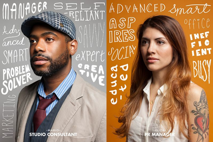
- Our persona sheets include goals, motivations, frustrations, behavior patterns, background, and context-specific details (details relevant based on the project, e.g., which mobile platform they use). We also add a profile image, name, some personal details, and demographic data to help with building more empathy and make them easier to remember.
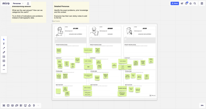
There are plenty of methods for synthesizing information, but we only dig deeper into the ones we use most frequently. You can find our downloadable persona template here.
Jobs to be done (JTBD)
JTBD is another framework we can use to find out more about the users’ needs and preferences. It is compatible with user personas, so we often use them together.
The personas focus more on the users’ behavior and attitude, thus help with empathizing and segmenting the different types of users, while JTBD places a more significant emphasis on features and aims to discover the reason why people choose a product in order to solve a specific problem and fulfill a need.
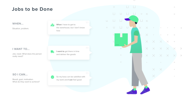
A famous JTBD example is connected to the milkshakes in McDonald’s. When the company wanted to increase the profit on their milkshakes, they first started interviews with representatives of persona groups, the customer types they knew to be the main milkshake consumers.
The researchers tested the temperature, the viscosity, and the sweetness of the milkshakes with this group, but they couldn’t find out how to improve the product. So they tried another approach.
They started observing and interviewing consumers on-site in McDonald’s restaurants. It turned out that people bought milkshakes mainly to keep them full till lunch and entertain them for the whole journey of driving to work. As a result, McDonald’s made the shake thicker in order to last longer while commuting.
They also moved the milkshake machine from behind the counter to the front, where the customers could easily and rapidly buy a milkshake with a prepaid card when rushing to work and avoid queues. Solving the real job to be done resulted in a sevenfold increase in the sales of the milkshake.
The HMW exercise is a great way to narrow down problems and discover possible opportunity areas.
We are not looking for exact solutions here yet, but rather brainstorm, explore questionable areas of core challenges while keeping an open mind for innovative thinking. For this to work, first, we need a clear vision or goal, a Point of View statement based on a deeper user need discovery. The POV should be human-centered, neither too narrow, to sustain creative freedom when brainstorming, nor too broad, so it remains manageable.
For defining the POV statement, personas and JTBDs we made earlier in the design process come in handy. By synthesizing the essential needs to fulfill, we make a template to create a statement.
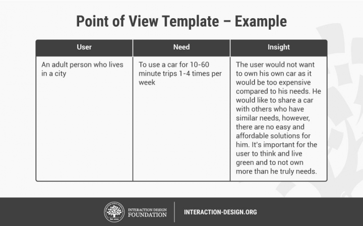
In short: [User . . . (descriptive)] needs [Need . . . (verb)] because [Insight . . . (compelling)]
Once we have the POV statement, we are ready to form short questions that can launch brainstorming on actionable ideas. For example:
- How might we…?
What’s stopping us from…?
In what ways could we…?
What would happen if…?
Then we may ask follow-up questions on the previous questions to examine the angles a bit deeper. By completing HMW sessions, we can get one step closer to forming ideas about exact solutions and executing the best ones.
By this point, we should have a condensed brief of research findings, a strategy, and a clear idea about what problem we want to solve.
At this stage of the product design process we’re far from creating high-fidelity prototypes and design systems, but it’s important to set a couple of broad, basic directions to have a general idea of where we’re heading and keep nurturing the creative imagination as we progress in the design process. Creating moodboards or a brand wheel can be a useful way to summarize our findings and have a point of reference during the next steps.
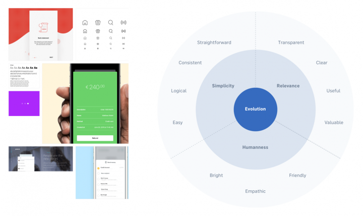
Depending on how many designers are working on a project, we can share the workload and either work on the same design or split up the tasks and progress simultaneously (e.g., one does the prototyping and the other building the design system and hi-fi part).
Step 3: Brainstorm solutions, define and prioritize features
The techniques we mention here can be done or can at least be started way before this step; remember, this is not a linear process, and it is possible to use these techniques in a different order or at different times of the project timeline.
The ideation phase begins when we have a good understanding of the project goals, and we narrowed down what we want to solve first.
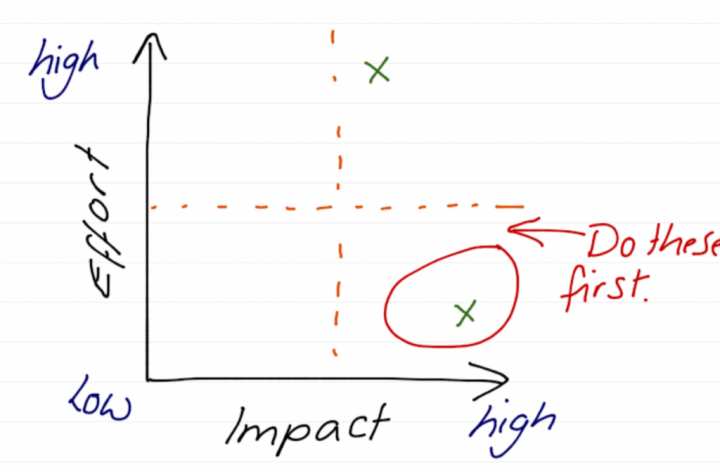
If there are still open questions about what features we should start with, the Kano model and the Impact-Effort Matrix can be helpful aids.
User journeys and customer journeys
User journeys and customer journeys are tools for mapping out the flows users go through when using a service or an application with one specific task to carry out.
Customer journeys and experience maps encounter the online and offline aspects of the users’ flow, providing a more holistic view of the process. As the output, the customer journey diagram lays out a big table. The columns of the table represent different phases or steps a customer goes through. These can be unique in every project, but most customer journeys contain three phases: before, during, and after the usage of our product.
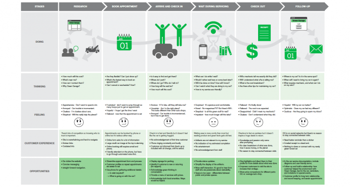
Opposed to customer journeys, user journeys analyze a smaller part of the journey, focusing only on what happens in the application, for example, during a sign-up process. At UX studio, we mainly use user journeys, but for longer projects with a bigger scope, especially if there is already existing user data about the customers and there is a journey that goes beyond application usage (e.g., arriving at the airport and using a ticket machine software), the customer journey is the preferred tool.
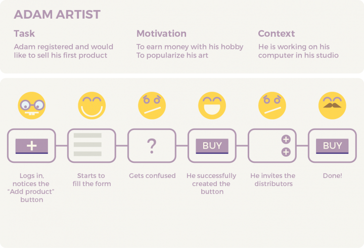
How we make user journeys:
- To start off, we determine the two or three most important goals the product should achieve. Every journey must have a task, motivation, and context.
- It’s also good to include a simplified empathy map nested within the journey map, indicating what emotional reaction the user has at each step. These are good indicators for us on which points we should handle with extra care or improve. These emotions can be assumptive but can also be based on solid data we gathered from our product discovery and research before.
- Creating user journeys is still part of the experimental phase. We don’t stop with one idea but try out different paths, reorganize the steps, complete the ideas, and explore.
- We want to find many different versions for each journey, as sometimes there are great first ideas, but oftentimes these are not the best solutions. For this reason, we create at least three different journeys for each goal. Then, once we come up with several solutions, decide on the winner.
User stories
User story creation is a good way to define features with stakeholders. What we want to accomplish in the product, why, and as what kind of user. It helps us stay focused on what features are necessary to focus on during the upcoming product design phases and reminds us what could lead to a “feature creep.”

High-level example:
As a sales agent, I want to turn more leads into customers so I can increase my income.
And a more detailed version of the example above:
As a sales agent, I want to keep track of unprocessed hot leads so I can make sure I don’t miss out on an ‘easy’ deal.
We can create user stories in several ways and styles. If we work on it with developers, it may become more technical and scrum-oriented.
Building the IA, sketching and wireframing
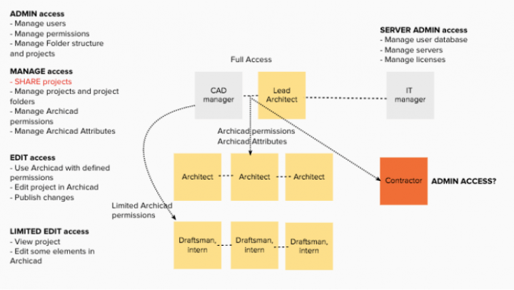
Building an Information Architecture is basically creating the blueprint of our design structure, the foundation of our first wireframes. IA is formed by creating a hierarchy and categorization of the information we gathered during the product designing process that results in a coherent, meaningful, navigable system.
How we sort out the features, functions, and available data in our product will significantly impact the user experience. Our best intentions with features can vanish if users don’t find them.
Card sorting is a great technique to validate our information architecture. We can do it on paper, but there are some online tools that can be very helpful too.
Sketching
We can start sketching early in the product design process when the first problems gain their shapes. Sketching is great not only because it can serve as a base when building something, but it also helps understand a problem. It also makes sharing ideas within the team easier.
Sketching on paper, where complex interfaces and functions of the software don’t limit or distract us, is an effective and rapid way to explore ideas and spot any design problems early on.
We don’t need to be skillful sketch artists or graphic designers who can draw and paint photo-realistically. The point here is not to create refined artifacts but to focus on ideas, flows, and possible layouts and use simple placeholder boxes for images and text. It’s about exploring execution ideas, so we don’t need to worry about the copy either at this phase.
It’s very useful to showcase the first sketches and wireframes with developers and other team members early on in the process. When we do so, they can share information on what is technically feasible and what is not, saving us from unnecessary rework.

The output of sketching is a wireframe, which is basically the skeleton of our upcoming prototypes — a barebone, static structure that will soon evolve into a refined design. A blank paper and a pencil are all we need, but using mock-ups for guidance can be helpful. Wireframes can also be made on digital platforms, using tools such as Axure, Adobe XD, Sketch, Figma, or even Photoshop.
By this point, we have a clear concept of what we have to do to design a product successfully, our strategy, and how to prioritize. We defined our MVP, the core features, and the core problem we want to focus on solely.
Step 4: Narrow down – Deliver
Prototype, test, iterate, implement.
This product design phase is all about doing the right thing in the right way. Reaching our goal, refining our MVP, and implementing the solutions.
Low-fidelity Prototyping
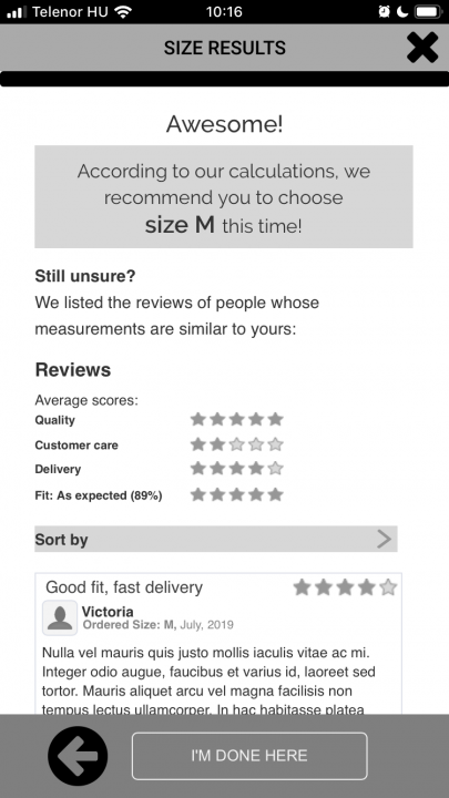
Making our ideas tangible with quick prototypes and test them as soon as we can save a lot of time and resources. For the sake of definition, what we call a prototype here is a modest-looking clickable digital product that resembles the features we aim to develop but in a simplified way.
Paper-based prototypes exist too, but we prefer the freedom and opportunities digital solutions can provide. The goal here is to find the usability issues before starting the detailed designs to avoid wasting time and doing unnecessary reworks.
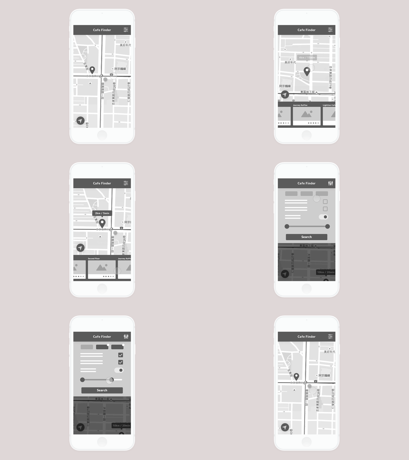
How we build prototypes:
- We mainly use Axure for interactive low-fi prototypes. With Axure, we can add dynamic elements, Javascript, or create databases. These are uniquely complex features in the world of prototyping tools.
- There are always three essential questions the user should be able to answer on every screen we design: Where am I? What can I do here? How can I move forward?
- Forget lorem ipsum and be scarce with dummy text. A sensible, contextual, guiding copy is just as important as visual hierarchy and affordances.
- We follow UI patterns and keep best practices in mind.
- We keep it simple. We’re testing the usability of layouts, key user flows, and navigation at this point. We don’t test refined visuals yet unless it’s not an MVP and we are testing already existing features in a live product.
- We design for mobile first if the project allows.
We create the first prototypes as soon as we can and evaluate them for usability tests. Refining the prototype iteratively after every usability test until we’re confident that we ruled out every major usability risk is a must. Of course, later on, we continue usability testing before and during designing every new feature.
High-fidelity prototyping
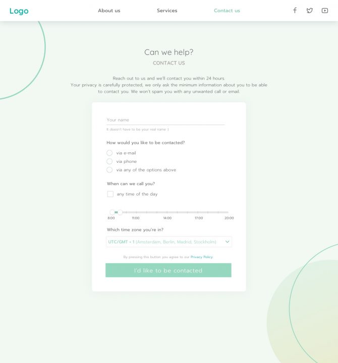
Now that we have the base of a usable product, it’s time to add the visual attributes, colors, icons, shadows, and images and refine the look and feel. The product’s design language has to be in harmony with the target audience, and it should be aligned with the brand’s vision. When testing the high-fidelity prototypes, visual elements are also important, and they lead to creating a stable, harmonized design system that we can rely on.
Quick tips for hi-fi prototypes:
- Create and maintain a design system based on brand guidelines and vision. Design systems facilitate effective collaborative work, alleviate decision fatigue, and assist designers in keeping consistency throughout the product. Even if it’s an MVP, the goal is to scale up the product if everything goes right, so building a design system is inevitable at some point when managing a successful product design process. It’s better to start building it sooner rather than later.
- We mainly use Figma, Sketch, or Adobe XD at UX studio, however, the choice often depends on the preferences of our client’s team and the technical requirements.
- Some tools, like Figma, have a built-in collaborative feature, but Abstract also can be a great complementary software for version control and storing files in the cloud. We export our design files to Zeplin for the developers.
- Ideating and prototyping should be an iterated process, such as continuous discovery with user research beyond MVPs.
Takeaways
Launching the minimum viable product doesn’t mean the job is done, and the product design process is over. Testing and designing should be an ongoing, iterative process. This is the key to improve the product and bring it to success.
Follow along with the metrics. Get client feedback, use analytic tools and heatmaps, do A/B testing, and measure the success of our choices.
This collection of ideas and steps we went through are not set in stone, simply an overview of available tools and methods we consider necessary to start off a product design process. The whole process becomes super iterative when working in a dynamic, agile environment.
The main takeaways are to make the process user-centered, apply design thinking, and execute it as a non-linear, iterated process. Do user research whenever possible to design with the people, not just for them.
Searching for the right UX agency?
UX studio has successfully handled 250+ collaborations with clients worldwide. Is there anything we can do for you at this moment? Get in touch with us, and let’s discuss your current challenges. Our experts will be happy to assist with the UX strategy, product and user research, and UX/UI design.
Post Credit:-https://uxstudioteam.com/ux-blog/product-design-process-steps/
