We are bombarded with images from the moment we wake up until the second we close our eyes. Our phones, our apps, our social media pages, and even our commutes to work are full of visual cues that we may not even notice – but our subconscious definitely pays attention.
In fact, we take what we see and form beliefs about the brands that use these images, whether we realize it or not.
This is because images have a powerful hold on our minds; they constantly help us form associations about a product, service, or brand, through the consistent messages we receive from them.
That’s why, when branding, companies have a number of tools in their communication basket – and you do too. There’s brand voice, which you use to speak to your audience. There’s your logo, color palette and tagline, which are used to foster emotional connections with the people interacting with you. And, there’s brand imagery, which are the images you use along with your logo to give visual expression to your brand.
Brand Imagery vs. Brand Image
If you’re confusing brand imagery with brand image, don’t worry – you’re not alone. Despite the similarity of the terms, each refers to something different.
Brand imagery is essentially a tool your brand uses to communicate with your target audience. Brand image, on the other hand, is the total picture that has been painted of your brand to the public, including its reputation and how it’s perceived by others.
Think of your brand imagery as one of the elements you use to express your brand identity – helping to influence your total brand image. In other words, imagery is part of what forms your brand image, but it works with other elements (like your logo, brand voice, and messaging strategy) to paint a complete picture of your brand.
Why is Brand Imagery Important?
It helps to establish customer loyalty.
This is one of the main reasons why a logo is important, and it applies to brand imagery as well.
Consumers make purchasing decisions according to their beliefs about a brand. People who are ethically conscious will go to Tom’s for footwear; those who want a car with good mileage will head to Toyota and snap up that Prius. Likewise, if your brand imagery can convey a specific message about your business, your customers will come to you based on their own beliefs about what you do.
It creates brand recognition.
If your images are consistent enough – whether in terms of color choice, scenery, or even the types of people featured – your customers will come to associate you with those images and spot you from a mile away.
It adds value to your brand.
You create the story of your brand, and that’s the one you tell the world. It doesn’t matter if you’re a small business that’s just starting out; if you brand your motorcycle business as the most reliable in the county, that’s eventually the story customers will be telling about you as well. Strategic brand imagery will help you reinforce the message that your brand is a valuable one.
Examples of Killer Brand Imagery
It’s easy to talk about this when it’s abstract and theoretical, but how does brand imagery serve its purpose in practice?
Let’s take a look at how some top companies use it to get their messages across!
Burt’s Bees

This international personal-care company has put the focus of their products on nature from day one. Whether it be their infamous lip balms, moisturizing hand creams or their newer makeup line, Burt’s Bees always sticks to emphasizing their mantra: “Providing customers with the best nature has to offer.”
How do they get this message across? Through their brand imagery! From their image-rich blog to their Instagram account, every image they use in their branding efforts has an element of nature. Sometimes it’s through an eye shadow pencil held against a background of trees, while in others, it’s a little bit of honey accompanying a facial scrub.
Tiffany and Co.
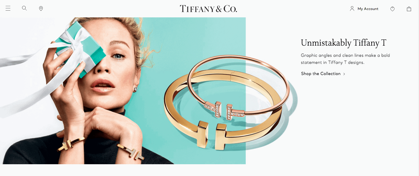
A classic example of brand imagery done right, iconic Tiffany and Co. is very specific in the images they use across communications. From an elegant, slab-serif font to a luxurious ribbon on all their boxes, much of their brand imagery features their products in the classiest possible ways.
Their brand focuses on “timeless beauty,” using neutral colors and models to give off that vibe. And, as their self-stated brand purpose is to “redefine love’s special moments,” you’ll see them selecting images that feature simple yet poignant messages along with their products. Just look at what they did for Pride Month:
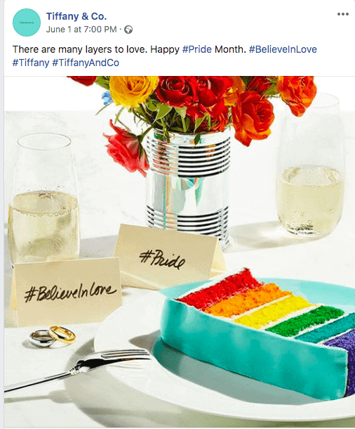
Regardless of the scene or occasion, they make sure to include the iconic Tiffany Blue (teal) in every photo. As a result, their audience sees resonant messaging like “Believe in love,” embossed elegantly next to Tiffany’s products in the background, and they are able to imagine themselves embodying a similar elegance as they celebrate their own special occasions.
GoPro
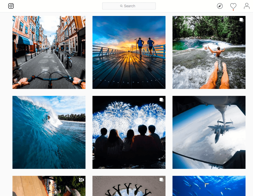
This technology company is all about being able to take their cameras everywhere you go, no matter the journey. Every photo on their Instagram page screams adventure, with deep, natural blues at the helm of each image (and the occasional contrasting orange to reflect a setting sun or attentive building).
Notice how many of these photos are taken from the perspective of the subject in a photo; you get the handlebars of a bike from one perspective, and a pair of knees in another. This is GoPro’s way of getting their potential customers to imagine themselves behind the lens of the camera and personally seeing these incredible sites – making them more inclined to purchase the GoPro products.
When Choosing Your Own Brand Imagery
Choosing brand imagery isn’t exactly a science, but it comes pretty close. Before you actually start using visuals, it will help if you lay out guidelines detailing what’s “acceptable” brand imagery for your business, so that you – and others – will have a cohesive strategy put in place.
To do that, first iron out the following:
Goals.
Remember that every single image, color, icon or illustration you put out into the world will contribute to the world’s perception of your brand. Because of this, you need to choose your images with intention. Ask yourself which values and messages you want to express across the board, and what you want to get out of using each specific image.
The authentic you.
Even if you have the expression part down, are the images in line with your brand values? Can you deliver on the experience that you’re promising in your images?
Aesthetic is important, but it’s not enough to win over an audience on its own; in order to create the brand loyalty discussed above, your audience will need to see your brand imagery as authentic and cohesive with their perception of your brand.
Colors.
While you don’t need to limit yourself, you should make sure your color palettes remain on-brand. Colors carry a lot of psychological weight, as every person has their own implicit, emotional associations with different hues.
It’s important to decide in advance which color palette is the right one to represent your brand (ideally one that corresponds with your logo) and have said pallette appear consistently across your brand imagery.
Shapes.
Geometric shapes have their own influence on our subconscious, with universal meanings that transcend geography and cultures around the world. Like colors, you can use them to elicit emotional responses from your target audience.
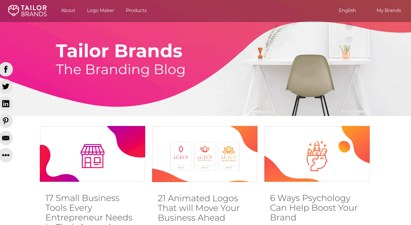
Not to toot our own horn, but you can check out the Tailor Brands blog as an example of what we mean:
Notice how while the thumbnails reflect their own unique blog post topics, each and every image sticks with the same basic color palette. Even the geometry of each thumbnail corresponds with the other, and it is consistent with the way our blog is branded.
Backgrounds.
Like Tiffany and GoPro, it’s important to set the scene for your audience. Remember that they’ll come to associate your product/service with the scenarios in which you put them, and that scenery is just as crucial for conveying certain values and messaging.
If your brand focus is making people happy, you may want to include smiling faces in your brand imagery; if your goal is to elicit relaxation, consider forests, oceans, and other calming backdrops.
Where Should You Use Brand Imagery?
Everywhere! However, before you set out to create new images for your brand, you should first do an audit of the current images your brand is using. Make sure to look at all of the following:
– Social cover banners
– Blog headers
– Images in your blog
– Email headers
– Email images
– Across your website
– Ad campaigns
As you go through each image, ask yourself:
– When was the last time that these were updated?
– Are the images engaging?
– Which images had the most “likes” or reactions from your audience?
– What kind of messages are your images sending, and is the message uniform or all over the place?
– Are there any colors that keep showing up? What about shapes?
– Do your images complement your logo?
Answering these questions will help give you an idea of the direction your brand imagery should take.
All of that said, it’s also important to keep context in mind. As each platform can have varying audiences, there will be differences in the types of images that resonate across each one. Make sure to do your research and find the best practices of each.
For example, on Instagram, there are several statistics to be made aware of, like that:
– Textured images get 79% more likes than images with low texture.
– Images with lower saturation get 18% more likes.
– Pictures with one dominant color have better engagement rates than those with multiple dominant colors.
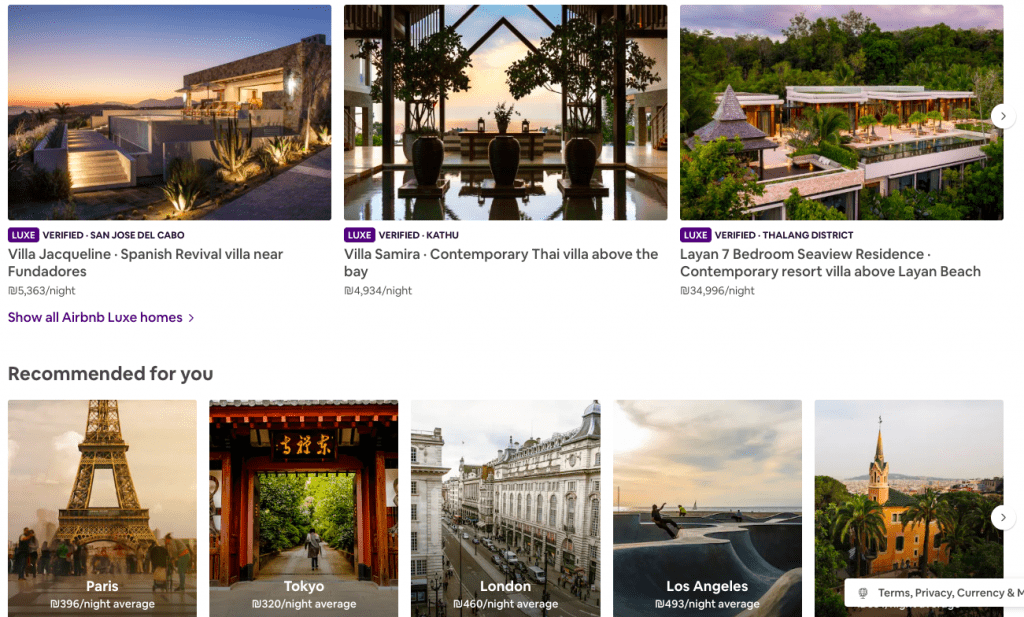
Let’s say you want to create the perfect social cover header – what should you think about?
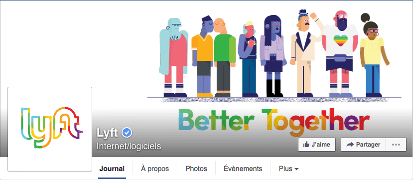
For those who are unsure, we’re talking about the prominent, large images that are featured at the top of Facebook, Twitter, Pinterest and LinkedIn business pages. Cover photos are usually found next to (or behind) a smaller profile picture, and the two images are meant to work together to tell a consistent brand story.
These images provide an awesome opportunity for using effective brand imagery in order to have an ongoing conversation with your audience. And, this section of your social media pages is the perfect place to change your images based on the season, wish your clients a happy holiday, reflect an upcoming sale or promotion, or simply highlight your business’s personality.
When you use like-images consistently across social channels, people will be able to connect with and relate to your brand no matter where they’re interacting with you.
To create the perfect cover header:
– Stay within the dimensions of each social media channel that you’re updating your banner for. For example, Facebook cover images display at 820 by 312 pixels, but they will work for both mobile and desktop view at 820 by 360 pixels.
– Ensure consistency between the colors and fonts and what appears on your header images. Remember, you want your images to work together, and that includes the finer details of each design. You can use photo editing apps like Instasize to play with text styles, filters, beauty tools and more, to make sure you’re creating a cohesive brand aesthetic with cool-looking images!
– Change images often, especially when the seasons shift, a promotion is being run, or you’re participating in a local event.
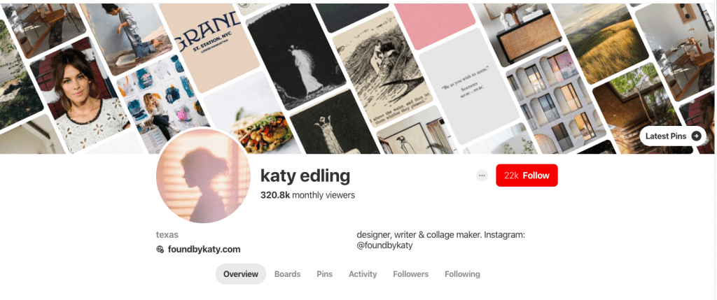
When you know what your brand needs and are ready to start using images, there are loads of places to find free stock photos.
You can also consider teaming up with a photographer in exchange for the products/services you offer; or, (and don’t quote me on this) try taking a stab at staging your own images. Our phones are all equipped with professional-grade cameras, and the filters and editing tools today can make for some pretty compelling brand imagery!
Over to You
Remember, brand imagery is all about connecting with your audience – but the most important aspect to keep in mind when choosing any image is whether or not it reflects your brand personality. Once you have that down, it’ll be easy for you to select images that convey your values, resonate with your audience, and help you build a successful brand.
