How does color psychology affect users’ attitudes and behaviour? There is a master trick, which can help to build a digital product which works more effectively. Psychological effects of color on our experience and decision-making matter, so let’s see how this affects the users and what sort of principles exist when designing experiences.
Color is an essential instrument in any designer’s tool stack. Studies covering color psychology and more specifically, psychological effects of color on human behavior show that it takes 90 seconds for a customer to form an opinion about a product and 90% of the time, this opinion is influenced by colors. In spite of the fact that color is usually viewed as only an aesthetic decision of the designers, it is a core element of the emotional and cognitive impact of a design on users.
Color is also the easiest element to remember when it comes to encountering new things. The concepts of color psychology can be applied in user experience design as well as marketing.
Color Psychology and Color-Emotion Associations
Research shows that light and color can affect our mood, sleep, heart rate, and even our well-being. An interesting example can be seen in our daily lives: blue and green light (e.g the nature and sky) encourage us to wake up in the morning. This is why many doctors and scientists recommend against using our mobile devices before going to bed as the screen’s light keeps us awake and can even cause insomnia.

Considering that there is a vast amount of possible color mixtures that can be created, it might be difficult to determine which one will have the greatest influence on a website or app. It would be too complex to examine everything, but there are a few tricks and related trends on how color affects users’ attitudes and behavior.
A well-considered color palette can upgrade a design from good to great, while a mediocre or lousy color palette can lessen users’ overall experience and even intervene with their ability to use a site or app properly.
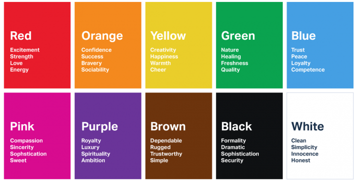
Colors can stimulate the emotions of many people. Check out the following color psychology figure below to see some of the impressions and themes traditionally associated with colors:
If you’d like to learn more about color meanings, and the psychology of color in advertising, check out Canva’s interactive tool on the meaning and symbolism of colors.
Color preferences
Depending on their age, gender, and the impulsivity of their actions, users have different reactions to colors and shades. Although color preferences are not universal, there are universal differences between genders’ preference in some colors over others. Also, color preferences can depend on the age. In the following sections, I will discuss color preferences depending on age, gender, and how they can be perceived differently in various cultures.
Age
When marketing your business, it is necessary to know who your target audience is, in order to tailor your marketing efforts accordingly. When researching users and their demographics, age is an element that should be examined carefully. Your target audience’s age influences their perception of marketing materials, especially considering that color taste and preference varies based on age.

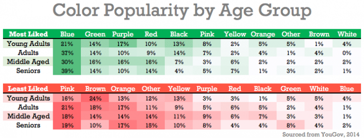
In the book Color Psychology and Color Therapy, Faber Birren investigates which colors are desirable for different age groups. Considering the color psychology of blue and red, he found that blue is consistently preferable throughout life. Yellow is preferred in childhood, which preference tends to decline as we age. As people mature they favor colors of shorter wavelength (blue, green, violet) rather than colors of longer wavelength (red, orange, yellow).
As the chart below shows, while most audiences like energetic and saturated colors, older people often think that garish bright colors are repulsive. So when designing a product or marketing material for older users, you should be cautious with bright colors — too vibrant can decrease the conversion.
Gender differences: Men vs Women
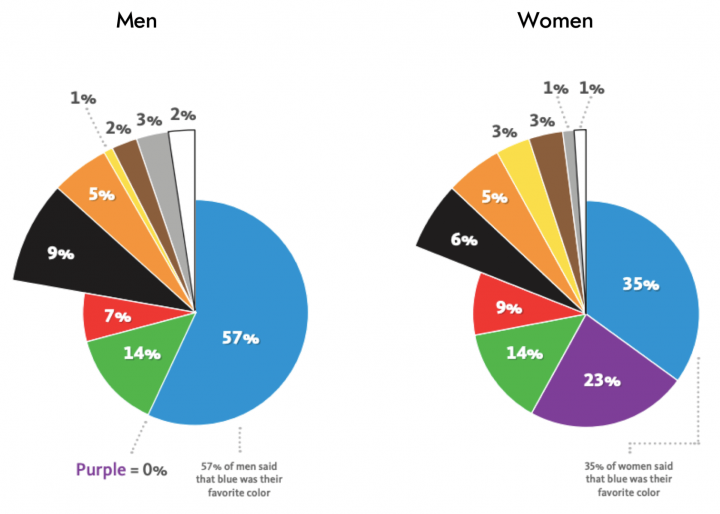
Is there a difference between genders with regard to their response to color? Although findings are ambiguous, various studies continue to indicate that men and women have varying preferences when it comes to masculine and feminine colors choices. Research on color perception indicates that men favor bright, contrasting colors, while women prefer softer shades. Both men and women like blue and green, but many women adore purple while this color repels men.

Cultural Differences in Color
Besides age and gender, one more factor that influences our color preferences is our cultural background. For instance, in most Western cultures, the color white is linked with aspiration, innocence, chastity, and hope. But in parts of Asia, white is associated with bad luck, death, and mourning.
It’s crucial for those involved with web and user experience design to look at the cultural connotations of the color palettes based on the relevant target audience for the website or product. For instance, designers can pay less attention to the implications the chosen palette may have in other cultures when the product is primarily targeting a particular culture. To prevent negative cultural connotations, for products that target a global audience, a balance between the colors and imagery is required.
The 60-30-10 rule
The 60-30-10 rule is a theory for making color palettes that are aesthetically pleasing and adequately balanced. The purpose is that one color, usually something rather neutral makes up 60% of the palette. An additional supplementary color makes up 30% of the palette. And then a third color is used as an accent for the rest 10% of the design.

This approach makes it much simpler for designers to set up the trial and error with original or uncommon color palettes without going too much beyond the anticipated norms within a business brand or industry. Choosing a set of some uncommon hue can lift the aesthetics and design. Additionally, it can be the first move toward generating a brand palette that is much more progressive than the one of its competitors, thereby setting the brand apart, making it more distinguished and remarkable.
Color psychology & visual hierarchy for UX
When it comes to setting a brand apart from others, the brand’s choice of color is a fundamental element that reinforces both its personality and the qualities of the products or services it offers.
Also, one of the vital roles of color in the field of marketing, user experience, and behavioral design is using it to influence where people look. If users don’t look at your navigational system, your product won’t be usable. In digital psychology, one of the fundamental skills you need to master is the art of controlling where your users look. In most design work, we control user attention by increasing and decreasing the salience of visual design elements.
Impact of color on conversion rates
Okay, let’s delve into the exciting stuff, the psychology of colors in business and the colors that increase the purchase rate. In other words, the colors that sell. How can we use color theory and psychology to get people to click on a button? What colors are really going to boost the conversion rates and improve the bottom line?
There’s always been a debate between conversion rate optimization experts, arguing whether the color red is more eye-catching color for a button, or green because that means “go.” There are plenty of A/B test results that show how a change in the color of a CTA button made a drastic impact on signups. HubSpot shared the following famous test from their early days when they were known as Performable:

Even though Hubspot initially estimated the green button would lead to a higher conversion rate and perform better, the red button outperformed by 21% more clicks.
The bad news is that there isn’t a magical color that consistently performs best for all websites. However, there are some general rules that can help you use color to your advantage. Here at UXStudio, we work with clients to ensure that their products and services are designed with the target audience in mind, and therefore implementing color and design elements that lead to the highest conversion rate.
Questions for testing color choices
Here are a couple of test questions you can ask users when you’re testing out your color choices. Although, you are not going to ask about colors explicitly but you can figure out users’ perceptions of your brand and design with the following questions.
- Before visiting (this website/app), please tell us how do you expect the site/app to look like?
- How would you describe this site/app?
- What are your first impressions? The first keywords that come to your mind when you see the web/app.
- Where would you click/tap first? why?
- On a scale of 1 (very unpleasant) to 5 (very pleasant), how did this site/app make you feel?
- How likely or unlikely would you be to trust this company?
- Can you think of any other companies that have very similar offerings? How would you compare this company to them?
All in all, trust your eyes
As a recap here is a short list to keep in mind for a well-colored digital product:
- Color can affect on everyday behaviour as well as stimulate emotions in people, what is more, every single color has a special meaning. Before deciding the main colors of an app, checking a color palette will definitely help you to find the perfect matching tone with the right message.
- There are universal differences between genders’ preference in some colors over others, additionally color preferences can depend on the age too. Take care of your target audience while choosing the perfect color for your digital product.
- Color is just one thing, but people who will use your product are more important! Remember HubSpot’s Call To Action’s color test and the fact that there are no magic in the field of colors just a well defined target audience.
- Use the given questions while testing your color choices!
Continue learning with UX Studio
As UX/UI Designers and Researchers we know why people will love your product and which techniques will help you to create fantastic websites/apps that people will love to use. For more read our other post: Designing Apps For Seniors: 5 Traits Worth Considering
For additional reading, check out our Product Design book by our CEO, David Pasztor. We ship worldwide!
Make sure to check out this great guide by Design Wizard on Color Theory. It explores primary colors, secondary colors, tertiary colors, and monochromatic colors. There is also a detailed section on the meaning of colors, and branding!
Post credit:-https://uxstudioteam.com/ux-blog/color-psychology-in-ux-design/
