The Project:Workshop architects has conjoined with various professionals and renders services ranging from Architectural, Interior Design, Project Management, Design Implementation, and Turnkey solutions. WA is a team of highly talented and qualified professionals where Pro-Activeness and Pragmatic approach towards projects are the keywords for operation.
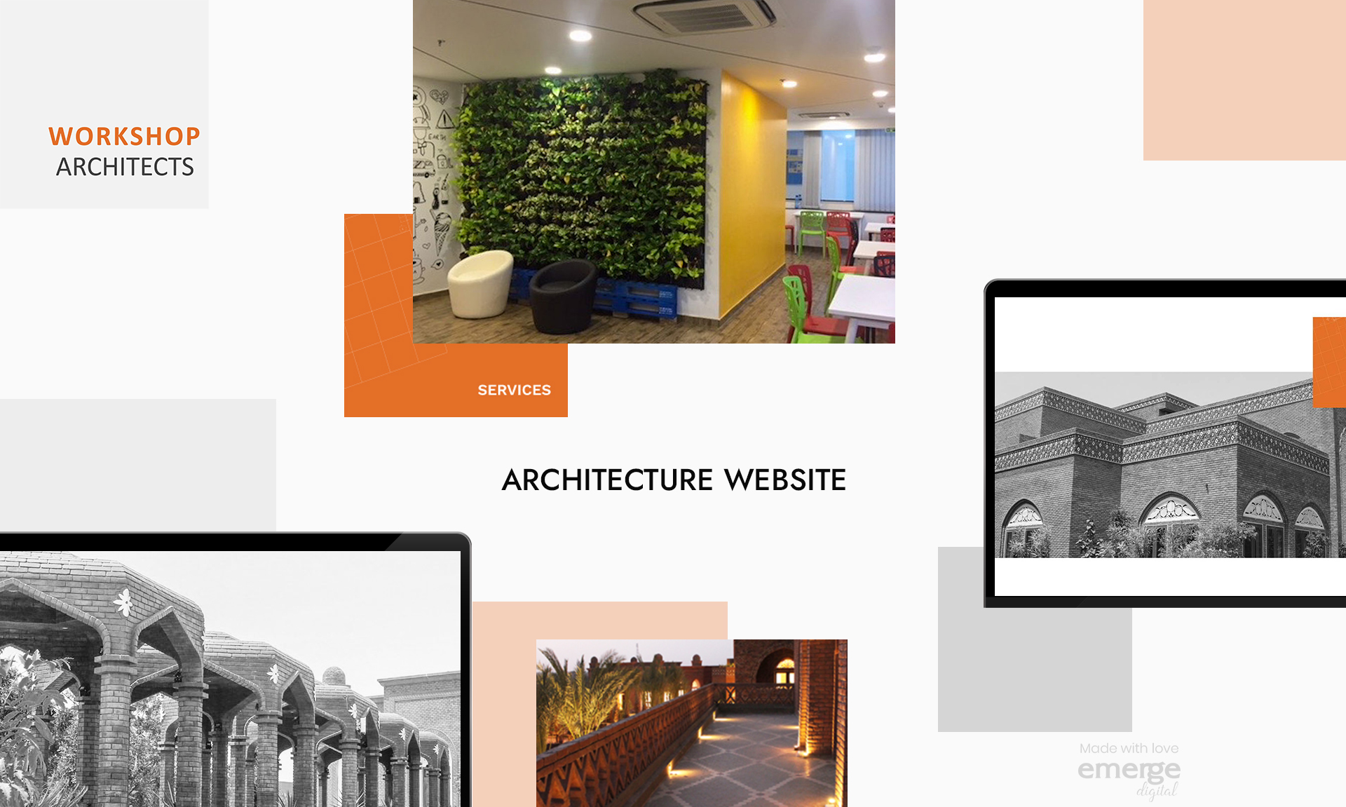
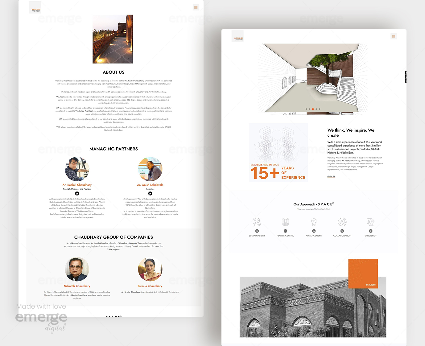
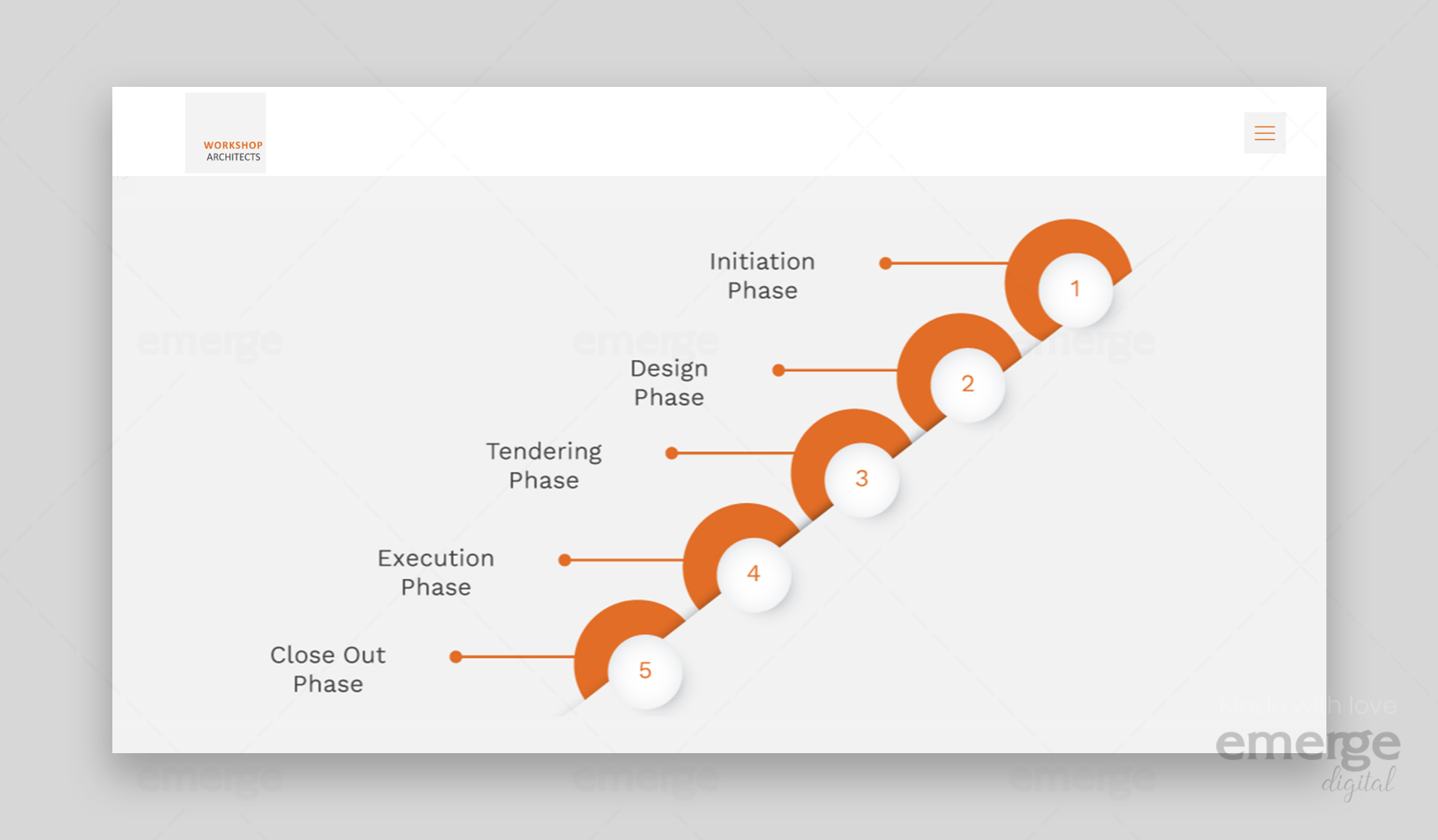
Problem: Our client wanted us to create something beautiful, Minimal to suit their purpose. An out-of-the-box design of layout but is truly comprehensible. Where the awesome works of the firm are presented in asymmetrical layout coupled with white space and an amazing hover effect. Similarly, the inner pages of the website also have stunning designs with cool and subtle animation upon scrolling.
Solution: A good dose of simplicity plus amazing visual impact greatly described our Vision for Workshop architects website. As images are more captivating than mere text, the homepage is loaded with large images that represent projects arrayed one after the other. Each of the projects has a slider that highlights important details.The homepage is packed with essential elements such as awesome transition effects, quality images and other essential elements.
It also embraces the power of white space in the success of every website specifically, the website is built with features that can make the brand shine.
We designed and developed a website that has a beautiful presentation of works on the homepage where the potential client has different options for viewing the projects such as perspective, interactivity, identity .Altogether, the elements in this website are pretty cool and useful.
-
-
-
- Sophisticated design
- Aesthetic appeal
- Quality images
- Beautiful typography
- Smooth slider
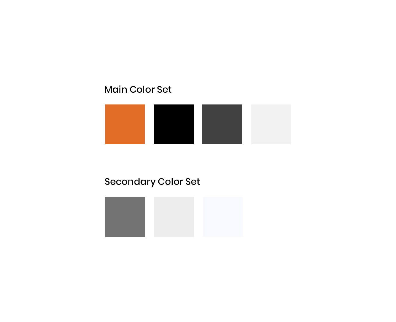
- Smooth colours
-
-


