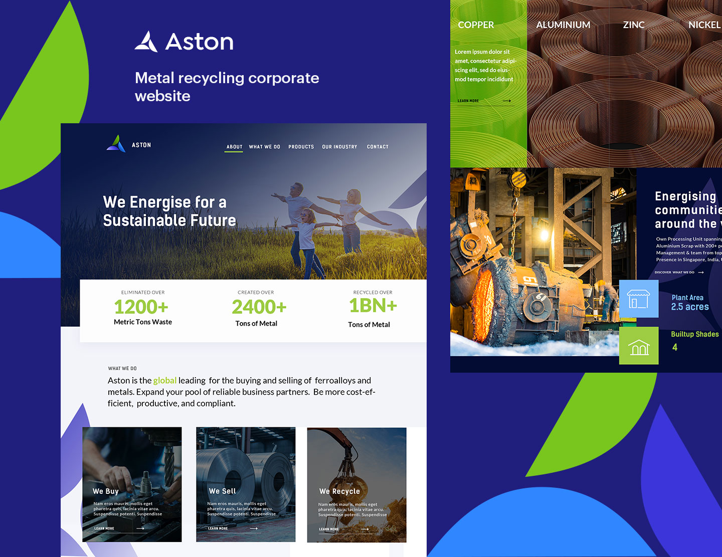
About Aston:
Aston is an esteemed metal processing and trading company. It recycles metal scrap into new and quality metal products. Being at the heart of the metal scrap recycling industry, Aston contributes significantly to global sustainability. The group has its presence in Singapore, India, the United Kingdom & the Netherlands. It has been in the market for more than 70 years and enjoys a credible reputation in the industry.
Challenge:
Aston is at the forefront of metal trading and processing. It provides an extensive portfolio of products and at the same time works for the better of the environment.
The challenge hence faced was to have a logo that would correctly represent the values, the work, the trust and the integrity of the company. Aston approached the Emerge Digital team for the same and hence started a meaningful and successful business relationship.
Solution:
Our Creative and Brand Strategy team came together to craft a tailored solution for the brand. We understood the brand requirements, realized the essence of the company, broke down the brief, and set on a journey to create an iconic logo that would not only represent the company but also be memorable.
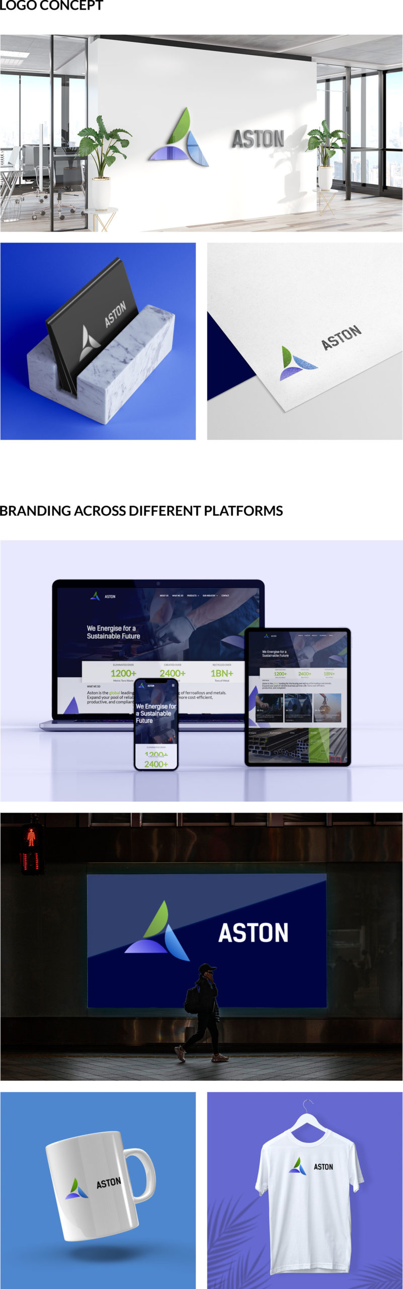
Deliverables – Logo Design
We wanted to design a logo that would truly embody the spirit of Aston. With extensive research and brainstorming by our professionals and with a sound understanding of the subject, we designed a logo for Aston that was truly iconic.
It was creative, yes. But more importantly, it conveyed the essence of Aston. It stood out. We crafted a logo that was not easily forgettable.
Breaking down the logo:
‘The Circular A’
Sustainability is at the core of Aston. Aston is at the forefront of the Indian Circular Economy. This idea, value and achievement had to be portrayed. It is the essence of Aston. For the same reason, the Aston logo appears as a ‘CIRCULAR A’, representing the circular economy Aston is proudly a part of.
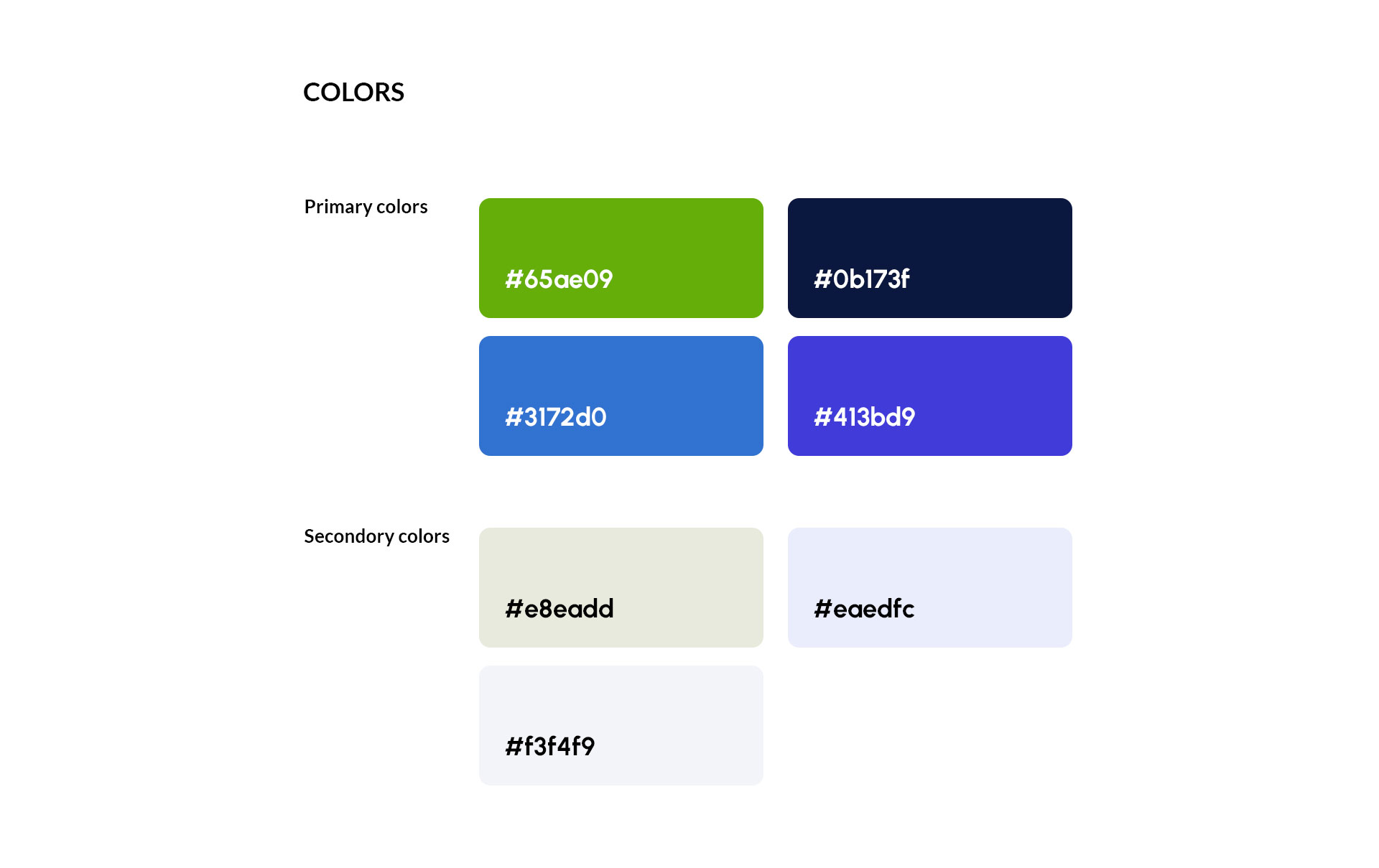
Brand Colours:
Green:
The green colour in the logo represents the core of the company. It stands for the efforts that Aston takes towards recycling, sustainability and for the protection of natural resources.
The colour green at the same time represents balance, harmony and growth, which the company strives to provide to all its stakeholders.
Blue:
Aston has been in the industry for more than 70 years. It works with integrity and aims to provide products of excellent quality. The blue colour in the logo is a symbol of the trust and the expertise that the company holds. It represents the use of sophisticated technology and evokes the feelings of security, confidence and professionalism that the brand provides.
Violet gradient:
The violet gradient represents the ambition, passion and innovation which is the pulse of the company. It denotes Astons’s endeavor for excellent quality. Aston is at the forefront of driving innovation and economic growth.
The violet gradient in the logo conveys the same.
Three Semicircles
The three semicircles have more to convey than the ‘A’ of Aston. Semicircles are soft, giving an inviting, friendly and trustworthy vibe, which Aston carries. It welcomes customers and businesses both to play their role in sustainability. The horizontal line of the semicircle shows stability, strength and efficiency. It shows that Aston is soft and inviting, and at the same time experienced, strong and cutting-edge.
Result:
With a blend of design theories, creativity and expertise, a truly iconic logo for Aston was created. The Aston team was highly satisfied with the process and the end result. It was a successful logo that told the story of the brand and conveyed the right message to the audience.