The Project
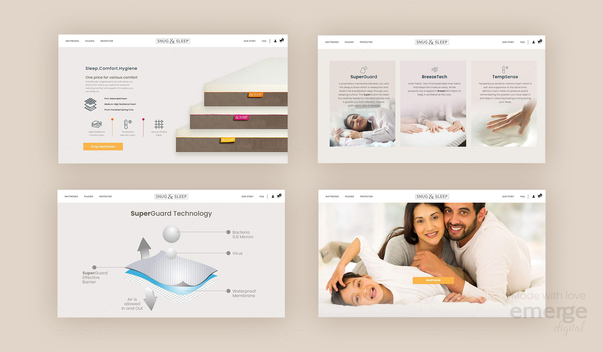
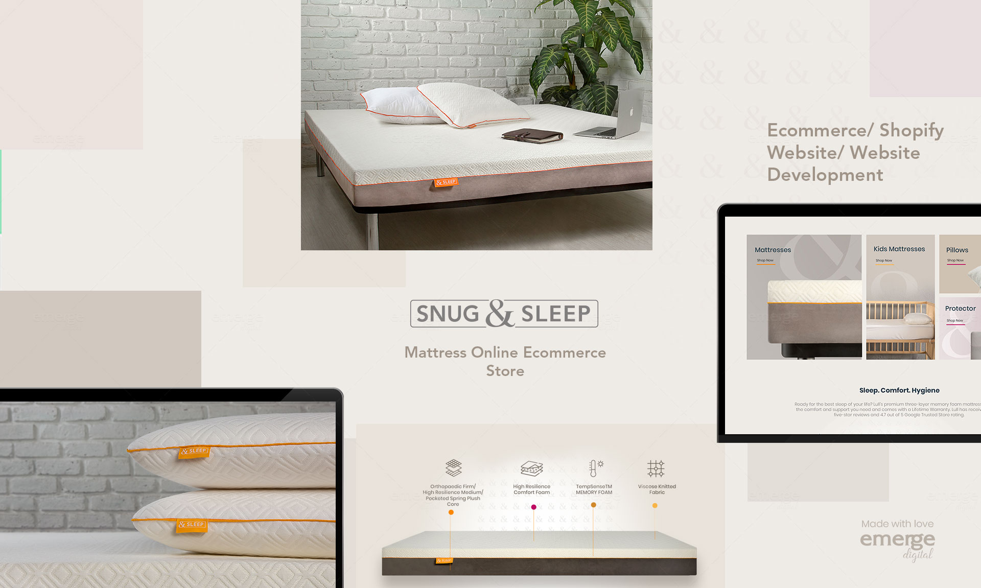
Constructed to be firm at the base with 100% virgin foam orthopedic rebonded foam block and topped with High resilience foam as a comfort layer and temp sense memory foam.
Problem
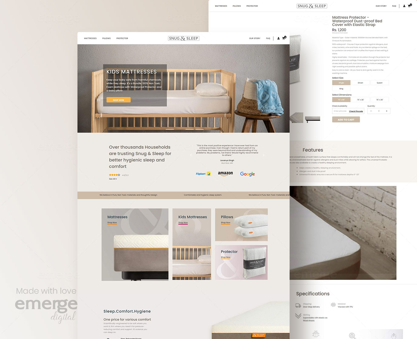
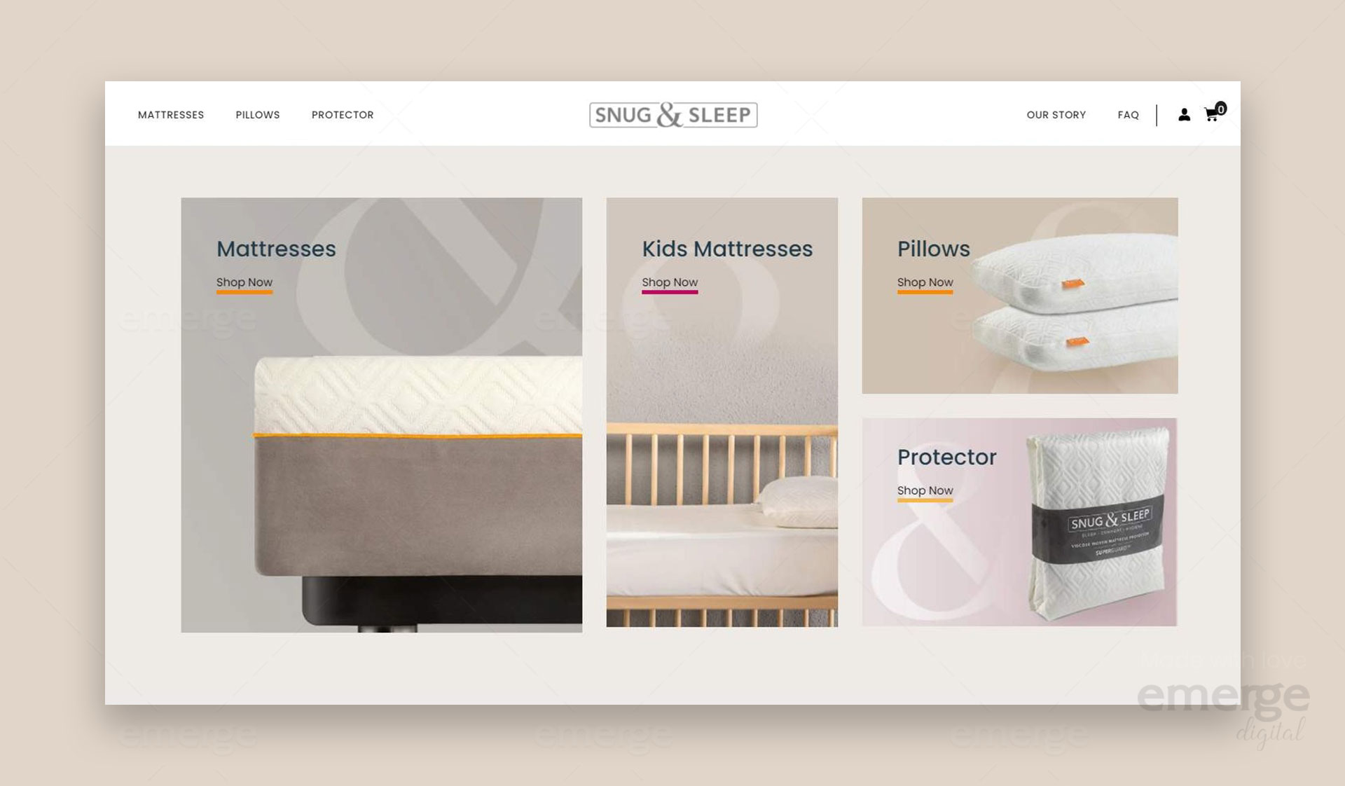
Our clients were looking to develop a ecommerce website for their business. Snug and Sleep have premium quality Mattresses, pillows, protectors but their bad website design would hinder a good user experience. Their previous website was dull, understated, and boring. It showed more products rather than specifying the benefits of the products. After understanding the problem we came up with an effective new layout and design for our clients.
Solution
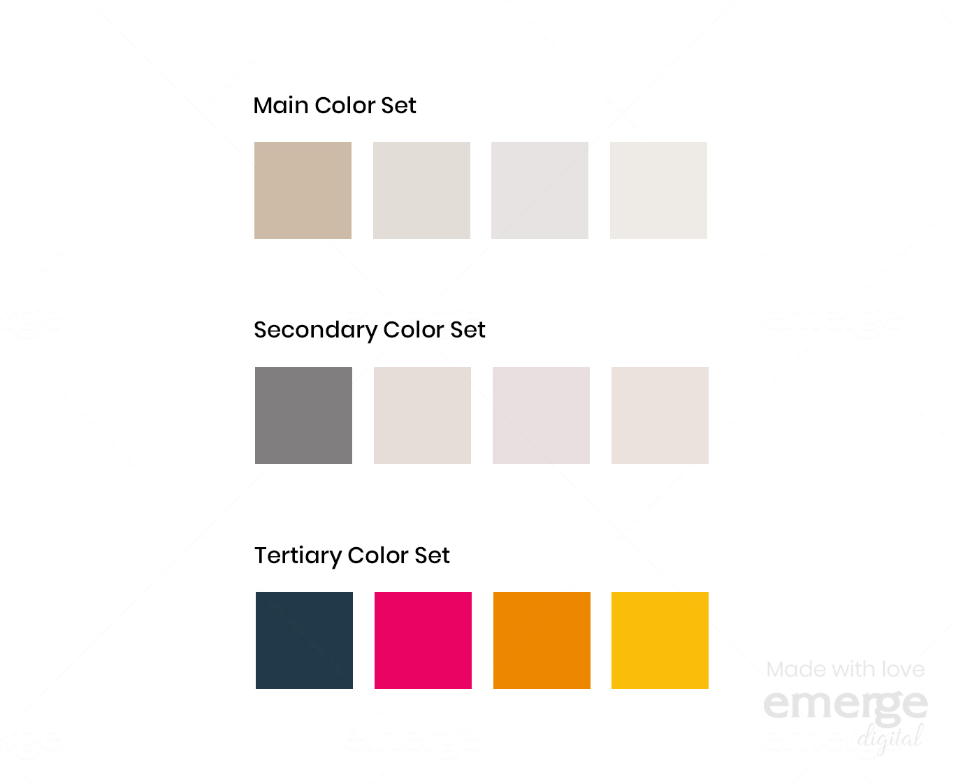
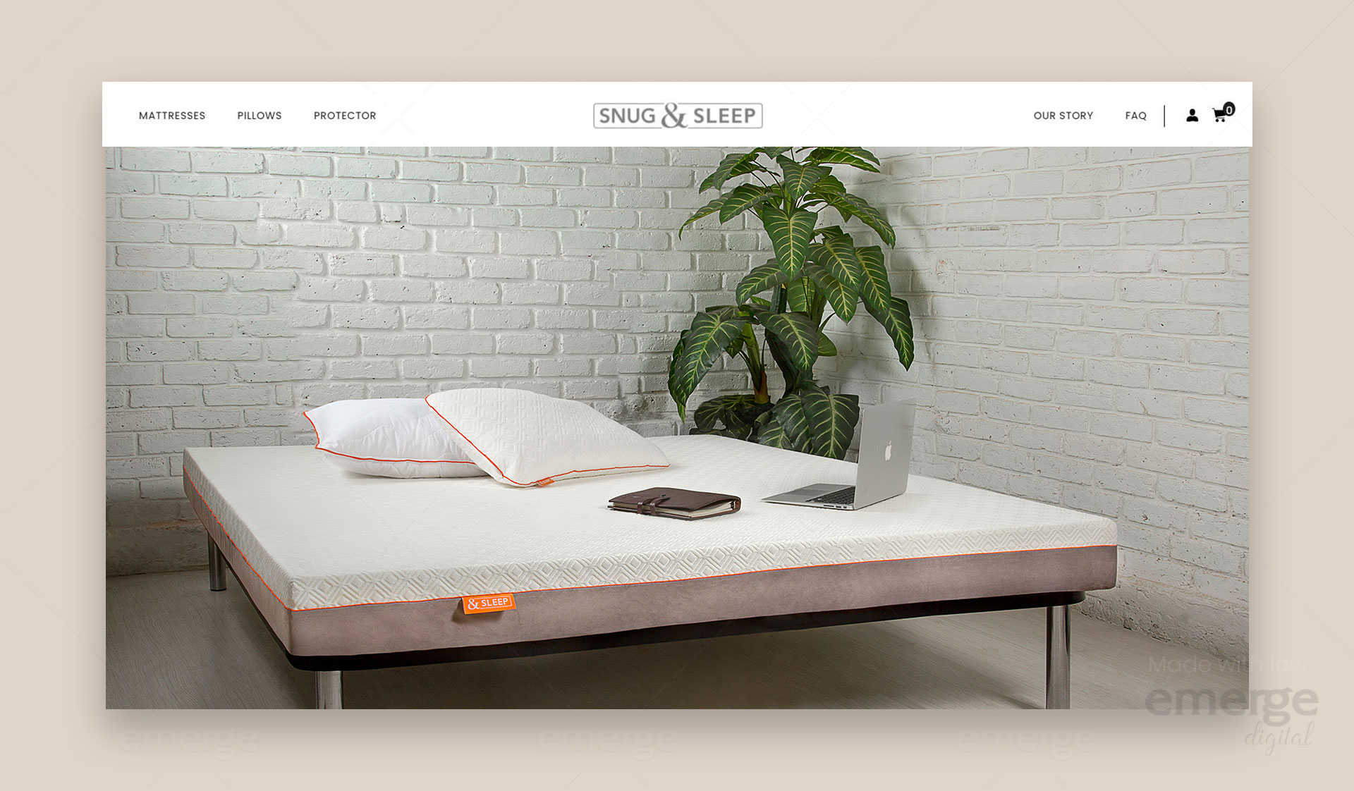
Our team emerge digital came up with lively and colorful designs for the business which created a pleasing layout that conveyed the premium quality of products. We tried to add more human elements to the website by adding more content format, videos, graphics, better structuring of products, and complete visual overhaul. We avoided using jargon for easy understanding. we created a simple and user-friendly experience for the customers.
Creating a more human-centric visual language
We designed and developed a new ecommerce website to support the brand, with all the increased functionality the team needed.
After multiple brainstorming sessions, together with the great team at snug and sleep, we managed to align their brand identity and visual language with their evolving business needs.
-
-
- Lively colours
- Premium look
- More content formats
- More social profits
- Human element
- comprehensible
-
